Footers! What do you understand about it? Is it the small content we see at the bottom of the page? Yes, Your thoughts are just in the right place. Now, let’s brainstorm a little more on footers.
Can you guess what it does to your website? Conventionally speaking, this little space at the end of the page was traditionally used to deliver either contact information or copyright messages.
With the modernization in place, this little space has also seen a great deal of evolution in terms of its usage. Nowadays, it is considered one of the most precious spaces for Shopify website holders to communicate repetitive messages.
These messages can be in the form of either writing or drawing. With little to write, a powerful message is being conveyed in the form of art to their visitors.
Key Takeaway :
Adding social media icons to the footer of your Shopify website can unleash the power of branding and increase engagement with visitors. Follow these step-by-step instructions to add and customize icon images in your Shopify footer, and ensure that they are optimized for responsive design and SEO.
Why Put Social media icons in the Footer in Shopify?
Have you heard of the term “icons”? Of course, yes! The Screens of your smartphones are flooded with it. And we know you definitely enjoy arranging it as per your priority on the home screen. Arranging the icons signifies your interest, usage, and trust in a particular business.
This small and simple symbol has the power to represent the whole business. Just within a glance, we are able to determine which online platform it is. Be it Facebook, WhatsApp, or Amazon. The miniature art piece has everything to tell about their presence.
Now, just imagine what happens if your Shopify platform has these little monsters and is perfectly placed in the right space. Well, it can unleash the power of branding in a flash of a second.
The footer is the perfect space to place your visually appealing icons on the website. With a single glance at your Shopify Icon bar, visitors randomly navigating through the website may find it interesting and engaging for them.
In this article, we have arrived at the tricks and techniques to increase the awareness of your Shopify platform. Here is a complete guide to adding icons to your Shopify platform (let it be the standard plan or Shopify Plus).
The Importance of a Well-Designed Footer
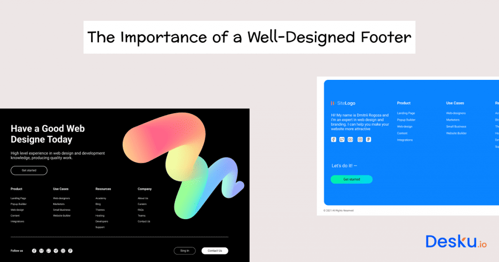
Websites are the windows of any e-commerce platform. If not meticulously crafted, it loses its aesthetic appeal and the customer’s eyesight. For the Shopify website holders, the footer plays a vital role in promoting their business brand. Overlooking to design your Shopify footer can elevate your branding campaign.
Want to know how a well-crafted Shopify footer can elevate your business and boost your brand? Here is a step-down array of logical reasoning to enhance your knowledge.
One of the important roles of footers is to increase the engagement time of the visitors. By providing valuable links and important information, footers serve as a navigating medium for visitors. It increases the curiosity of the visitors to go further and explore more on your website. Thus increasing the trust and know-how about your products, which can be directly proportional to their buying decision.
Who doesn’t like to see a design that soothes an eye? Human eyes function uniformly with tangible as well as virtual things. Well-designed, beautifully crafted, and meaningfully created footers are no exception.
Footers can prove to be a visually appealing medium to spread your business footsteps in a particular direction. Whether you want to communicate about an eco-friendly business approach or a tech-savvy platform, placing the respective icons in the footer can be strategic.
Again, meticulously crafted footers can convey your attitude to the minute details. Never missing on the tiniest aspects, it promulgates the message of punctuality and honesty towards your services or products.
Well-designed footers not only occupy just a bottom space but have the ability to capture the gist of the entire website.
Also read: How to Connect Shopify Forms to HighLevel
Choosing the Right Icons for Your Brand
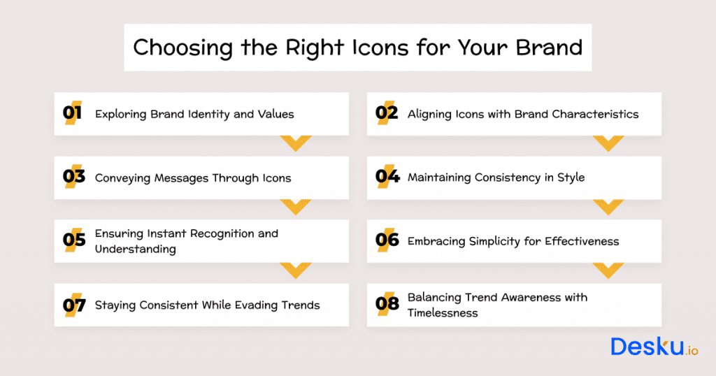
Like choosing the ideal accessories for an outfit, choosing such icons comes down to the details and deep understanding of your brand. Carefully chosen icons turn into expressive pictures whose meaning can be grasped in just one look. This is a guide on how to select suitable and effective icons for the Shopify shop.
Exploring Brand Identity and Values
Do you know just like humans, businesses do have a persona? Brands play an important role in magnifying and promulgating this personality aspect. Identify what your business reflects, be it vibrancy, novation feminism, or eco-friendly characteristics.
Aligning Icons with Brand Characteristics
Once the personality of a brand is identified, it is wise to choose the icons that match your brand identity. For example, if your business is about selling eco-friendly products, go for the icons exhibiting an environment-friendly aspect.
If your business is tech-driven, place the icons that characterize the fast-paced, innovative links connecting the blogs sharing valuable insights.
Conveying Messages Through Icons
A picture is worth a thousand words, and icons truly reflect this aspect. Propagating a message is the only goal, and icons stand out in their communicating aspect. Consider the message you want to deliver, and icons will do a smart job of spreading the word through their picturesque quality.
For example, if your business revolves around a social media platform, incorporate corresponding icons in your Shopify footer.
Maintaining Consistency in Style
Consistency is one of the unique qualities which the human mind subconsciously notices. If randomness prevails, the footer loses its charm to keep the visitors engaged in your online platform. Go for any style, be it line art or flat or complex design, but remain consistent in crafting the entire layout of the footer.
Ensuring Instant Recognition and Understanding
Ensure the icons you choose to place in the Shopify footer are easy to understand and can be correlated with your message.
Embracing Simplicity for Effectiveness
Simple things are remembered the most by the human brain. So, go for simple icons to increase their effectiveness.
Staying Consistent While Evading Trends
We recommend going for consistent icons to reduce your efforts in updating the icons as per the changing trend.
Balancing Trend Awareness with Timelessness
Want to give a trendy touch to your icos? Make sure to carve a balance between trendiness and eternity, as trends are not perennial, but simplicity does. So we recommend going for icon collections that don’t fade with time and seem eternal and catchy in any time frame.
Also read: How to Add a video to Shopify Video Banner Section?
How to Put Icon Images in Footer Shopify: Step-by-Step Guide
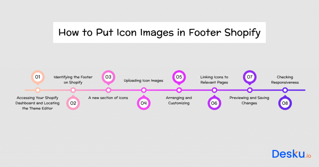
Whether it be adding attractive social media icons or editing payment icons, there is no need to visit the help centre or try and error with your Shopify theme. Just check these steps:
1). Accessing Your Shopify Dashboard and Locating the Theme Editor
Start by logging into your Shopify account and reach your store’s admin dashboard. Visit the “Online Store” page, and there you’ll find the details on how to personalize your storefront.
Click “Online Store” and in the sub menu, “Themes .”It will take you to the Theme Editor with all possible modification abilities.
2). Identifying the Footer on Shopify
Identify the dedicated part in charge of content for your footer. Depending upon the theme you have selected, the position may change. Generally, there is the option for footer customization in the “Sections” or “Customize” menu.
3). A new section of icons
If it works well with the theme, then incorporate a footer section of icons. Here, you upload and sort out your selected icon photos. The creation of this new section should follow the prompts or the instructions provided by your theme.
4). Uploading Icon Images
After identifying the footer, the first thing to do is look for the upload option. Then, select the icons you wish to place in your Shopify footer and upload them one by one. Make sure the size of icons is appropriate as per the size of the footer.
5). Arranging and Customizing
Once you have uploaded all the icon images in your footer, the next thing to do is arrange them as per your desire. Make sure the arrangement of the icons is aligned with the array of messages you want to deliver and creates aesthetic appeal to the visitor’s eyes.
6). Linking Icons to Relevant Pages
Now, the most important thing comes into place. Link your Shopify footer icons with relevant pages. If icons do not enhance the navigation and engagement of the user, their presence is almost nullified in the footer.
7). Previewing and Saving Changes
Once icons and links are in place, it is always wise to preview your footer. It gives an accurate idea of its actual presence on the website. Once you are satisfied with the preview of your footer, save the changes.
8). Checking Responsiveness
The last and least important thing to check is to ensure that the footer imparts the same aesthetic appeal in all devices, ranging from computers, laptops, and tablets to mobile screens.
Your Shopify footer is all set to cast its visual magic on all devices!
Customizing Icon Appearance and Placement
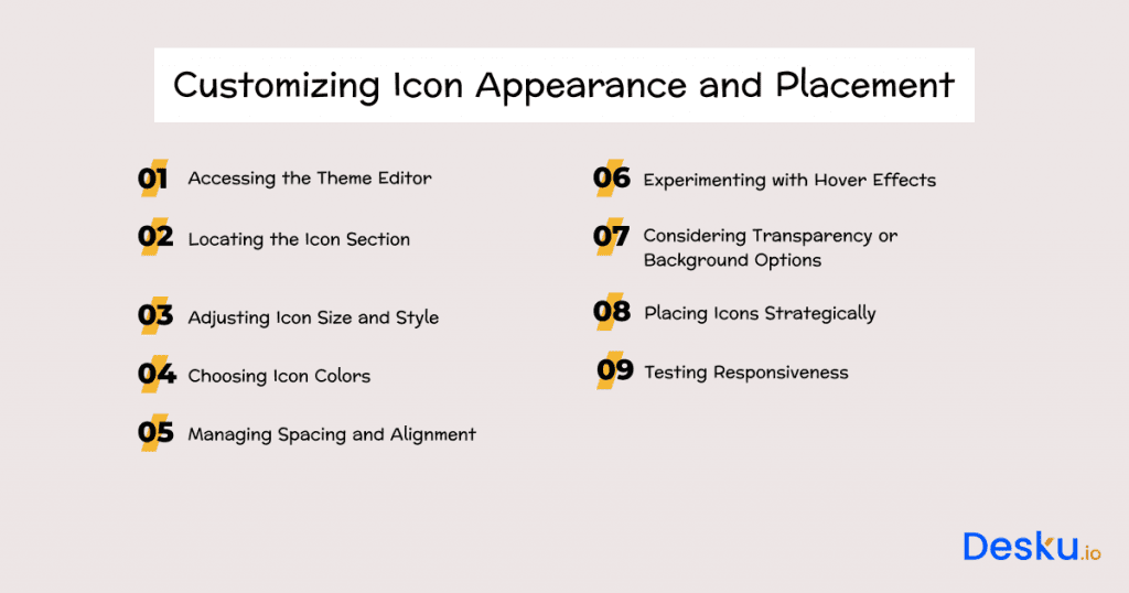
Icons remain the same, but numerous factors, such as their arrangement, size, spacing, and background effects, may magnify the footer’s aesthetics and can prove to be strategic in creating a huge appeal.
So, what are you waiting for? Just go through this guide and note down the steps to customize your Shopify footer.
1). Accessing the Theme Editor
First and foremost, look for the theme editor on your website dashboard. From this section, you will be able to choose various themes to customize your online Shopify store as per your desire.
2). Locating the Icon Section
Once you enter the Theme Editor in the Shopify dashboard, the next thing to locate is your Footer’s Icon section. It can be named “footer icons,” “social Icons,” or something similar. Once you click on it, “customize” options will pop up. Now, keep exploring various customizing options to change the overall view of your Shopify footer.
3). Adjusting Icon Size and Style
One of the customizing options allows you to change the size and the style of the icon as per your requirements. Opt for the appropriate size and go for the style consistent with the overall website.
4). Choosing Icon Colors
Color reflects the vibes. And the icons you choose reflect the vibes of your business personality. So choose the color of the icons that are in sync with your business traits as well as with the appearance of the website.
5). Managing Spacing and Alignment
Space management is an important aspect of organizing things. This aspect should not be overlooked while arranging the icons, as improper spacing between the icons may create visual clutter and not appeal to the viewers.
6). Experimenting with Hover Effects
If you want a little dynamism in your Shopify footer, look for the themes that grant this option. Ensure this experiment with the hover effect turns out to be appealing and interesting.
7). Considering Transparency or Background Options
It’s completely your choice to either go for a transparent background of the footer or you want to add color to it. Whatever you choose, make sure it does the job of highlighting your icons in the footer.
8). Placing Icons Strategically
Order is important. We all place icons on our mobile screens as per our use and need. The same thing goes in the Shopify footer, too! Place your Shopify icons in the correct order to maximize the user’s navigation.
9). Testing Responsiveness
We recommend seeing previews on all the available devices before you take a final call. The footer should be visually appealing and impart functionality to the same degree in all devices.
Not just social media, but you can use the same approach to enable payment icons and give your customers the flexibility to choose among many payment methods. Now, when you add payment icons in your footer, ensure you add images appropriately.
Responsive Design: Ensuring Icons Look Great on Any Device
It is mandatory to go for responsive design while designing your Shopify footer. Your website visitors can pop up from any device, be it a mobile tablet or laptop. Your Shopify footer should impart the same aesthetics and functionality across all devices.
So, we have come up with a small guideline to help you create a responsive design for your Shopify footer.
1). Embracing Mobile-First Design
Mobile is the prime medium used by people to surf the internet. Creating a Mobile-first responsive design assures the users enjoy a clean and visually appealing surfing experience.
2). Scaling Icons Appropriately
Optimize the size of the icons as per screen size of the device. Icons that look great on laptops may look too bulky on mobile phones.
3). Utilizing Media Queries
Media queries are an excellent way to incorporate screen-optimized style using CSS language. Don’t hesitate to use it to create a responsive and visually appealing Shopify footer for your online store.
4). Testing Across Devices
Frequently test your Shopify footer and icons on different devices. Verify how the various icons appear on desktops, tablets, and smartphones. The main purpose of tests is to make sure that all changes made for usability transfer smoothly onto other devices.
5). Prioritizing Icon Visibility
In smaller screens, consider the order of your icons. Since space on mobiles is restricted, list only those icons that are much needed. This guarantees a fast provision of important links, which skips irrelevant scrolling altogether. This ensures that users can effortlessly access crucial links without unwanted scrolling.
6). Simplifying for Smaller Screens
Small screens may not support complex designs. So go for simple designs which appeal to the eye of the visitor.
7). Optimizing Touch Interaction
Optimize the spacing between the two icons to avoid accidental clicking of the adjacent icons. Accidental clicking may frustrate the user and may impart a negative experience. So, it’s important to optimize touch interactions of the icons on the footer.
8). Monitoring Loading Times
Some users may experience prolonged loading time on their devices. So go for the optimal size of icons which quickly loads on the slow system without compromising on its visual quality.
9). Adapting to Different Orientations
Ensure your Shopify footer aligns quickly and appropriately on different orientations of the screen. This rule applies to mobile users who frequently shift orientations from portrait to landscape mode.
Optimizing SEO with Footer Icon Images
Think beyond the boundaries when you target to increase the visibility of your business in search engines. Incorporating SEO in the footer with the help of icons linked to the specific keyword is a strategic move. Don’t forget to use alt text in linking the icons with the most frequently searched words or phrases by web surfers. Make sure the keywords you link are compatible with the icons.
The more optimized alt text will assist search engine “crawlers” by providing essential contextual information, which increases the probability that your content will be correctly indexed. As a result, it helps improve search engine rankings and boosts the discoverability of your Shopify store.
If you optimize an icon alt text in line with your SEO goals, you provide greater accessibility to visual-impaired users in addition to building trust and authority in SERPs. Dual purpose hereby assures that your Shopify store is visually appealing as well as enhanced by search engines’ footer icon images, which will greatly help raise its online traffic levels and sales.
Conclusion
With an extensive journey on footers, right from naivety to expertise level, many things have resurfaced about the strategic use and strategic crafting of visually appealing footers.
We have seen how icons can be used in footers, how visually appealing footers can be created, what are the ways to create responsive design of footers, and how SEO can be incorporated in footers to increase the reach and visuality of your online store across various search engines.
In short, Footers are not mere bottom places of your website but can be game-turners if used strategically. Upgrade your Shopify store’s footer with Desku, your. Desku adapts to your business, ensuring a polished footer that represents top-tier customer service. Elevate your Shopify store now with Desku’s powerful support features.
Also, if you’re trying to increase ROI on your Shopify store, Desku can be your go-to solution for robust customer engagement. It will not only effortlessly manage customer inquiries but also help you track valuable insights through advanced analytics. You can easily scale support without sacrificing customer experience with Desku.

