Ecommerce success extends beyond attracting visitors and showcasing great products; it hinges on the entire shopping experience, particularly the design and functionality of the shopping cart and checkout process.
A seamless guest checkout flow, optimized based on best practices drawn from extensive analysis of leading eCommerce sites, can significantly reduce the 68% average cart abandonment rate. This comprehensive approach involves understanding customer behavior and preferences, optimizing the shopping cart to make it a pivotal part of the buying process, and implementing strategies to encourage customers to complete their purchases.
By focusing on these critical elements, businesses can enhance the customer experience, increase conversions, and boost their average order value (AOV), ensuring a smoother path from browsing to buying.
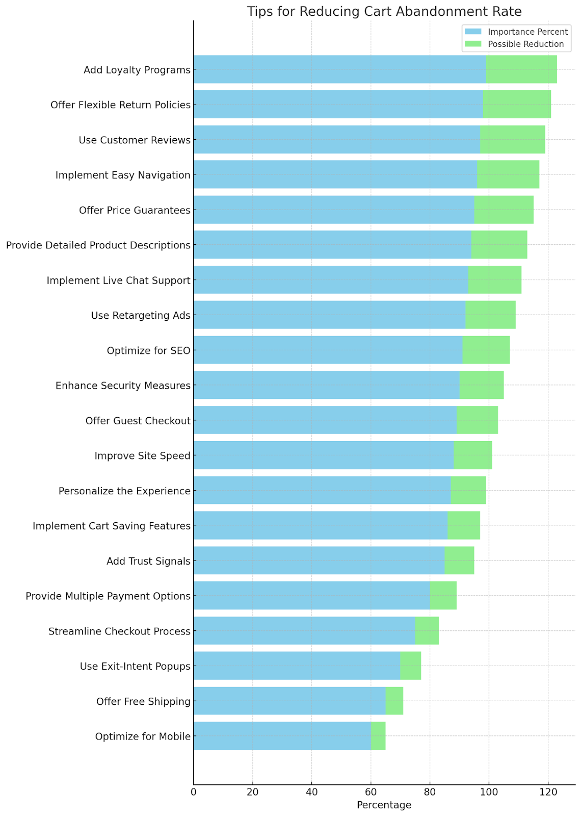
eCommerce Shopping Cart Practices Chart

eCommerce Cart Abandonment Stats That Open Your Eyes
- The Baymard Institute reports a staggering average cart abandonment rate of 69.99%, aggregating data from 48 studies with rates ranging from 56% to 81%. This indicates only about 30% of customers who add items to their shopping carts proceed to checkout and complete their purchase.
- Data from the Baymard Institute, as shared on Statista, shows a consistent increase in cart abandonment rates, from 68.07% in 2014, highlighting a rising trend over the years.
- The highest cart abandonment rates are observed in the home furnishing (90.50%), automotive (85.97%), and jewelry (84.49%) sectors, attributed to higher price points and extended buying processes, as noted by SaleCycle.
- In the APAC region, a 2022 report points to payment friction as a significant barrier for online retailers, impacting the conversion of visitors into paying customers.
- According to ContentSquare, the age group of 25 to 34 shows the highest propensity for cart abandonment at 21%, closely followed by the age group of 35 to 44 at 20%.
“MUST FOLLOW” eCommerce Shopping Cart Practices
To lay a solid foundation for your eCommerce business, start with these essential shopping cart practices. They address the basic yet critical aspects of the online shopping experience, ensuring your site is user-friendly and ready to convert visitors into loyal customers. ZSo, here are the “must follow” practices:
- Live Chat widget for customers
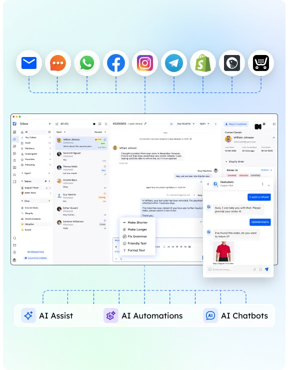
Let’s talk about adding a live chat widget to your online store. It’s a smart move that could make a world of difference in how your customers feel about shopping with you. A live chat widget lets you talk to your customers in real time, answer their questions, and make their user experience better.
Let me share some tips on how to make the most of this feature:
- Be There: Make sure your live chat is easy to find on every page, particularly during checkout, so you can solve problems as soon as they come up.
- Get Smart: Use automated answers to common questions. It’s a great way to save time and keep your customers happy.
- Know Your Stuff: Make sure your customer service team knows all about your products and how to fix issues. The better equipped they are, the better they can help your customers.
- Listen Up: Always ask for feedback on your live chat service. It’s the best way to make sure it’s working well and getting better all the time.
2) Optimize Your Website for Mobile Users
Optimizing for mobile users is crucial as a significant portion of online shopping is done on mobile devices. A mobile-friendly site ensures that the navigation, text, and checkout process are streamlined for smaller screens, improving the overall user experience. This approach not only caters to the growing number of mobile users but also positively affects your site’s SEO ranking, as search engines favor mobile-optimized sites.
3) Improve Your Site Loading Times
Enhancing site loading times is essential for keeping potential customers engaged. Slow loading times can frustrate users, leading to higher bounce rates and lost sales.
Implementing best practices such as compressing images, leveraging browser caching, and minimizing the use of heavy scripts can significantly improve loading speeds, ensuring a smoother browsing experience that encourages users to complete their purchases.
4) Add More Images
Incorporating multiple images for each product allows customers to get a better view and feel of what they are buying, which is especially important in an online environment where physical examination is not possible. High-quality images from different angles and, if applicable, videos can help replicate the in-store experience, providing customers with enough visual information to make informed purchasing decisions.
5) Work on Keyword Optimization of All Your Content
Keyword optimization is vital for making your products and content more discoverable through search engines. Conduct thorough keyword research to understand what your potential customers are searching for and integrate those keywords naturally into your product descriptions, blog posts, and meta tags. This strategy improves your site’s visibility and attracts a targeted audience more likely to convert into customers.
6) Multiple Payment Options
Optimizing your shopping cart experience is all about making sure you have all the payment options your customers might want. From credit cards to PayPal, and even digital wallets, having a variety of choices is key to providing a smooth shopping experience.
Here are some handy tips for you to consider in your ecommerce business:
- Make sure to have all the popular payment methods available at checkout. It’s all about trust, and presenting these options can convince your customers to go through with their purchase.
- Time is valuable, and some customers are in a rush. Offering quick checkout options can help keep these customers from leaving their carts behind.
- Why not include third-party payment platforms? They’re known for their safety features and can add an extra layer of trust for your customers.
- Have you thought about accepting cryptocurrency payments? It’s a growing trend and a cool way to show your customers that you’re keeping up with the times.
“INSANE LEVEL” eCommerce Shopping Cart Practices
Elevate your eCommerce game with these advanced strategies. Designed for those ready to push boundaries, these practices delve deeper into optimizing user experience and maximizing conversion rates through innovative and thoughtful site enhancements. Cehck out these “totally insane” shopping card related techniques to boost your revenue:
7) Keep Users on the Product Page After an “Add to Cart”
Implementing a strategy where users remain on the product page after adding an item to their cart encourages continued shopping. This can be achieved through a subtle notification indicating the item was successfully added, rather than redirecting to the cart page. This method leverages the impulse buying tendency, potentially increasing the average order value as customers continue to browse.
8) Offer Free Shipping
Offering free shipping is a powerful incentive for customers to complete their purchases. Studies have shown that shipping costs are a major factor in cart abandonment. By absorbing these costs or setting a minimum purchase amount for free shipping, businesses can significantly reduce abandonment rates and improve customer satisfaction, making it a win-win strategy for increasing sales.
9) Validate Before Purchase
Incorporating real-time validation during the checkout process can significantly enhance user experience by catching errors early and preventing frustration at later stages. This includes checking the format of email addresses, payment information, and other fields as they are entered, ensuring that all necessary information is correct and complete before the customer attempts to finalize their purchase.
10) Limit Distractions During Checkout
Creating a distraction-free checkout process is crucial for converting sales. This means minimizing or removing unnecessary elements such as menu navigation, excessive links, and unrelated product recommendations during checkout.
Focusing the customer’s attention solely on completing their purchase can reduce the likelihood of cart abandonment by streamlining the process and guiding them towards conversion.
Check these tips:
- Streamline the checkout interface by removing unnecessary navigation bars, links, and non-essential information.
- Employ a clean, minimalistic design that focuses the user’s attention on completing their purchase.
- Hide or minimize upselling and cross-selling offers during the checkout process to prevent decision fatigue.
- Use a single-column layout for form fields to simplify the visual flow and reduce distractions.
- Implement a distraction-free mode that darkens the rest of the website and highlights the checkout area, ensuring customers focus solely on finalizing their purchase.
11) Show Final Pricing in Cart
Transparency in pricing within the shopping cart is essential for trust and customer satisfaction. Displaying the final price, including tax, shipping, and any other fees, before the customer initiates the checkout process eliminates surprises and builds confidence in the purchase decision. This practice can lead to a higher conversion rate by reassuring customers of the total cost upfront.
“GOD LEVEL” eCommerce Shopping Cart Practices
For those aiming to reach the pinnacle of eCommerce excellence, these “God Level” practices offer cutting-edge techniques and technologies. They focus on creating an unparalleled shopping experience that not only delights customers but also significantly boosts conversion rates and order values. It’s the time to dominate with these techniques:
12) Multiple choice in shipping options
The goal of reducing the number of carts abandoned in your online store is accomplished. Now, let’s aim to make your customers’ shopping journey even better by giving them a selection of shipping choices. This smart decision not only improves your online store but also pushes your conversion rate up.
- Choices: Think about providing popular delivery options such as standard, express, and next-day delivery. This meets various customer needs and lifts their level of satisfaction.
- Simplicity: Create an easy-to-understand shipping choices menu. This makes the selection process less complicated and nudges shoppers towards the final step of the purchase.
- Rewards: Consider creating free shipping thresholds to motivate larger orders, which aligns with the best practices of shopping cart design.
- Honesty: Show different shipping costs and delivery periods. Being open and honest builds confidence and could help reduce the number of abandoned carts.
13) Enable Shipping Calculator
Integrating a shipping calculator directly on the product or cart page allows customers to estimate shipping costs before proceeding to checkout. This transparency addresses one of the primary reasons for cart abandonment – unexpected costs. By providing this information upfront, customers can make informed decisions, reducing surprises and fostering a sense of trust in your eCommerce platform.
14) Apply Visual Cues
Visual cues guide users through the shopping process, subtly encouraging them to proceed to checkout. This can be achieved through color contrasts, directional cues like arrows pointing towards the checkout button, or highlighting special deals and secure checkout badges. These visual elements not only enhance the user interface but also improve the overall user experience by making navigation intuitive and reassuring customers of their decisions.
15) Add a Virtual “Candy Rack”
A virtual “candy rack” introduces last-minute impulse buys during the checkout process. By strategically placing low-cost, high-value items or add-ons near the checkout, you can mimic the physical retail experience of grabbing small items on the way out. This practice can increase the average order value and enhance the customer’s shopping experience by offering complementary products or deals that are hard to resist.
16) Live-Use Product Videos Will Hit It Hard!
Incorporating live-use product videos on product pages can significantly impact customer engagement and conversion rates. These videos provide a dynamic view of the product in action, offering insights into its functionality and benefits that static images cannot. By showing the product being used in real-life scenarios, customers can better understand what they’re buying, reducing doubts and leading to more confident purchase decisions.
17) Map Your Internal Links Smartly
Smart internal linking ensures that customers can easily navigate your site and find related products or information without getting frustrated. This involves linking to related products, FAQs, and reviews in a way that feels natural and helpful. Well-planned internal links can enhance the shopping experience, keep users engaged longer, and ultimately guide them towards making a purchase.
19) Add a Progress Indicator
Adding a progress indicator during the checkout process provides clear visual feedback on how close the customer is to completing their purchase. This can significantly reduce frustration and abandonment by setting clear expectations for the length of the checkout process. It also offers reassurance and a sense of achievement as customers move closer to the end, encouraging them to complete the transaction.
20) Biometric Payment for Mobile Shoppers
Researchers predict that the biometric payment cards market will grow at a CAGR of 62.3% to USD 15498.82 million by 2032.
Implementing biometric payment options, such as fingerprint or facial recognition, for mobile shoppers offers a seamless and secure payment experience. This cutting-edge technology simplifies the checkout process, reducing the time and effort required to enter payment information manually. By offering a faster, more convenient payment method, you can improve conversion rates among mobile users.
21) Display the Order Summary Throughout the Checkout Process
Keeping the order summary visible throughout the checkout process reassures customers about their purchase decisions. This includes detailed information about the items, prices, chosen options, and total cost. Constant visibility of this information helps prevent confusion and builds trust, as customers can easily review and confirm their orders before finalizing the purchase, reducing the likelihood of last-minute cart abandonment.
FAQ: Understanding Cart Abandonment in Ecommerce
What is the abandonment rate of carts in ecommerce?
The abandonment rate of carts in eCommerce refers to the percentage of online shoppers who add items to their shopping cart but exit the website without completing the purchase. This rate varies across industries but is a critical metric for understanding shopper behavior and the effectiveness of an ecommerce site’s checkout process.
What percentage of online carts are abandoned?
On average, around 69.99% of online shopping carts are abandoned. This figure is a general estimate and can fluctuate based on a variety of factors, including the industry, product type, and the online shopping experience provided by the ecommerce site.
What is the average cart abandonment rate on Shopify?
The average cart abandonment rate for stores on Shopify mirrors the general ecommerce average, hovering around 70%. Shopify provides various tools and integrations to help merchants reduce this rate by optimizing their checkout process and improving the overall shopping experience.
What is the abandonment rate of carts in B2B?
In the B2B sector, the cart abandonment rate can be slightly lower than in B2C ecommerce, but it still poses a significant challenge. Rates can vary widely, but on average, B2B ecommerce sites experience a cart abandonment rate of approximately 60% to 70%. The specific rate can depend on factors such as the complexity of the buying process and the level of personalization in the shopping experience.
Why is cart abandonment rate high?
The cart abandonment rate is high due to several reasons, including unexpected costs (like shipping and taxes), a complicated checkout process, the requirement to create an account, concerns about payment security, poor user experience (especially on mobile devices), and lack of preferred payment options. Each of these factors can contribute to a shopper’s decision to leave their cart without completing the purchase.
Conclusion
Concluding our exploration of the 21 best eCommerce shopping cart practices to follow in 2024, it’s clear that the path to reducing cart abandonment and enhancing customer satisfaction involves a multifaceted approach.
From optimizing your website for mobile users to embracing cutting-edge biometric payment options, each strategy plays a crucial role in crafting a seamless online shopping experience. Implementing these practices not only addresses the various reasons behind cart abandonment but also paves the way for higher conversion rates, improved customer loyalty, and a substantial boost in sales.


